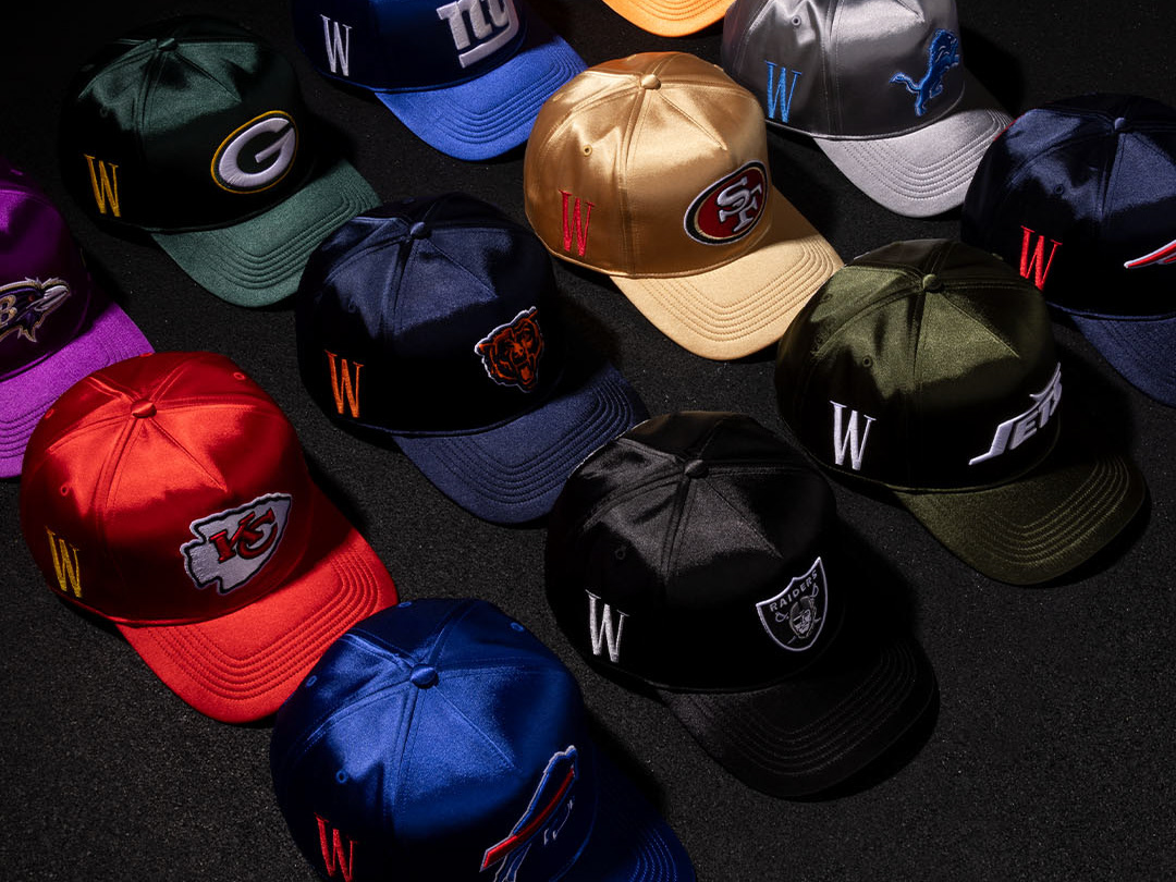
Project:
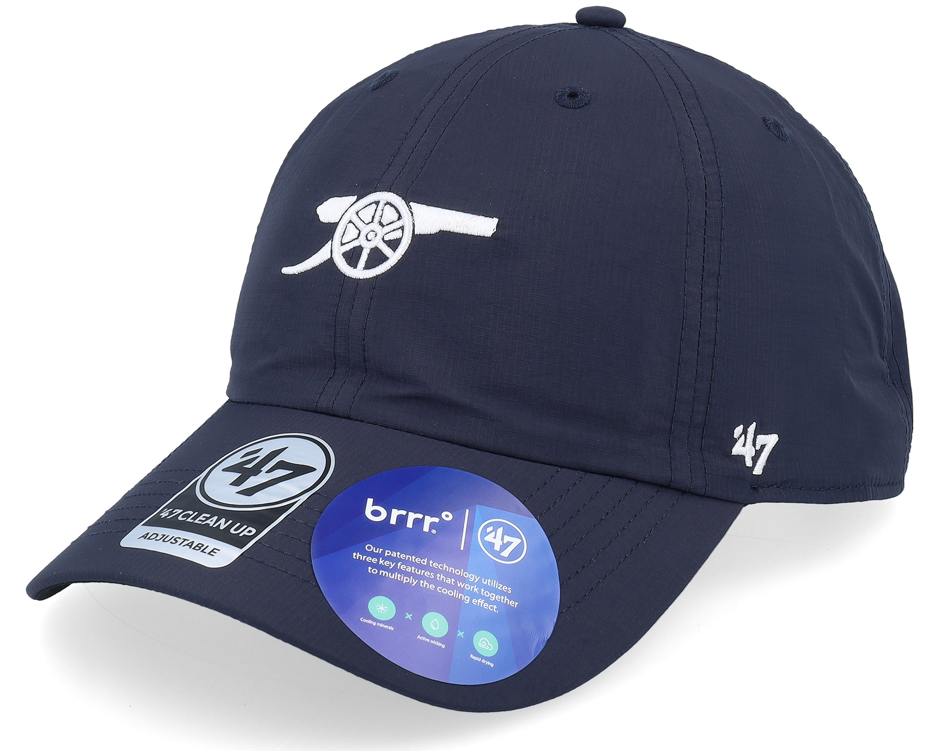
brrr is a cooling material the product marketing utilizes for our performance headwear. For the 2024 season '47 decided to utilize the high quality brrr Pro material which gave my team the opportunity to not only build out a new sticker but revisit our current brrr sticker to see if we were effectively communicating brrr's F&B's.

Step 1: Analyze Old Sticker
The gradient blue background was resonating with consumers. However, iconography needed to better communicate what brrr is and create a better hierarchy of information for consumers.
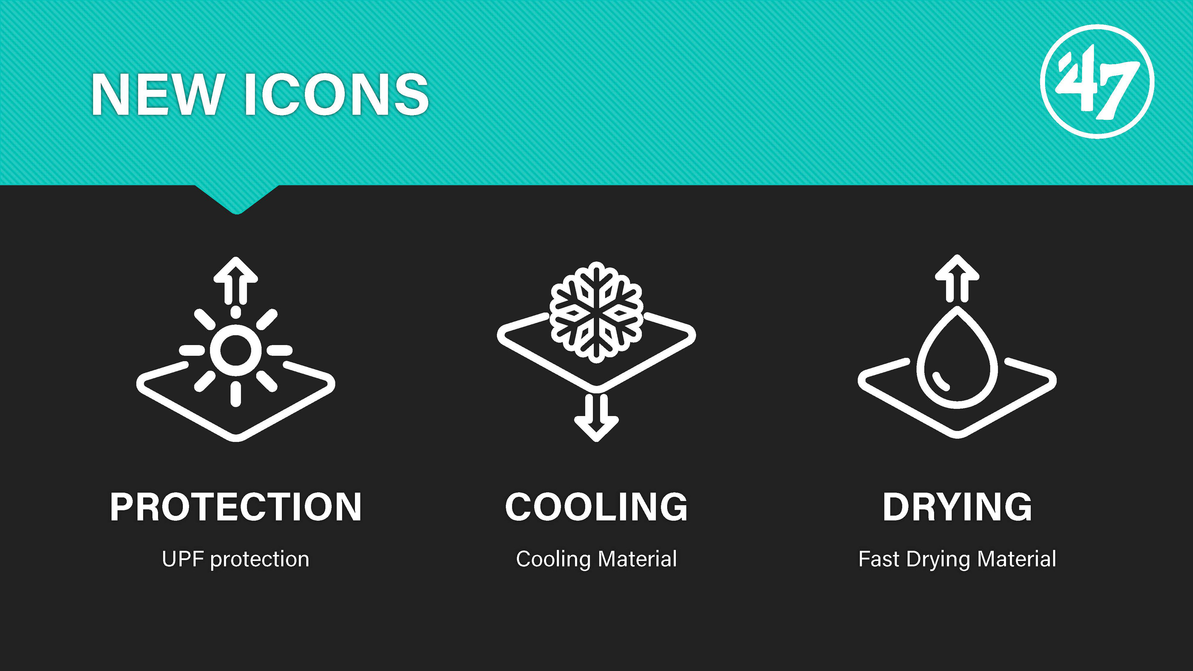
Step 2: Create New Icons
The original icons were very unclear and also did not highlight the best F&B's. These Icons were designed to highlight the most important F&B's and simple enough for the consumer to understand quickly what the material does.
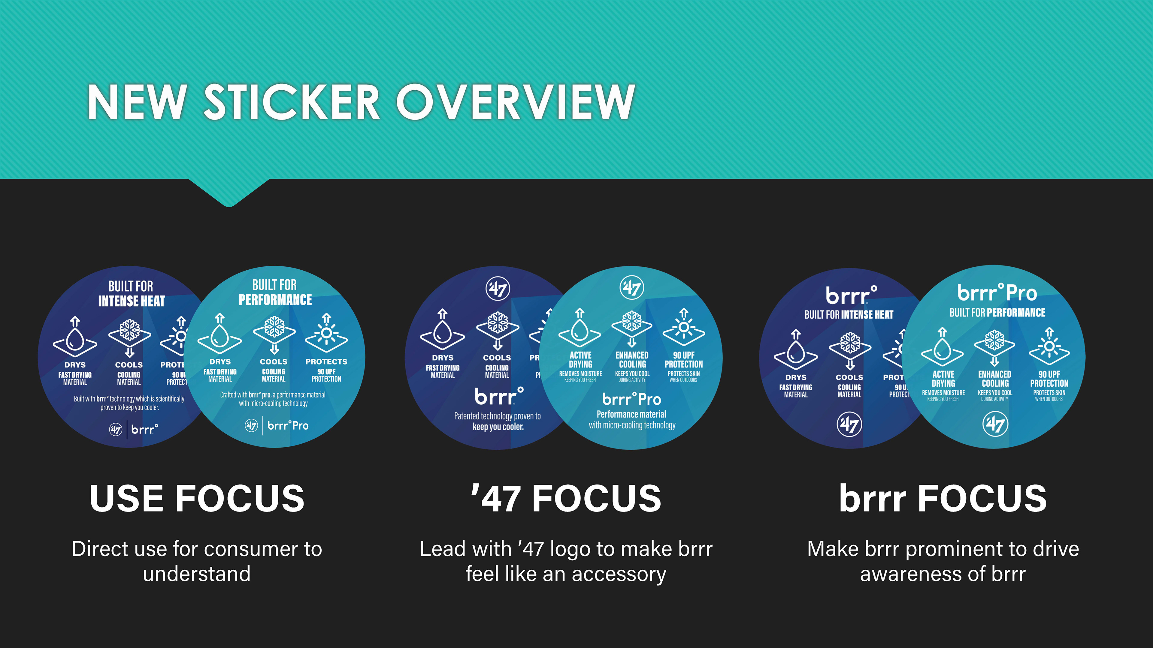
Step 3: Develop Variations
To limit the amount of back and forth between design and the product team I provided multiple options.
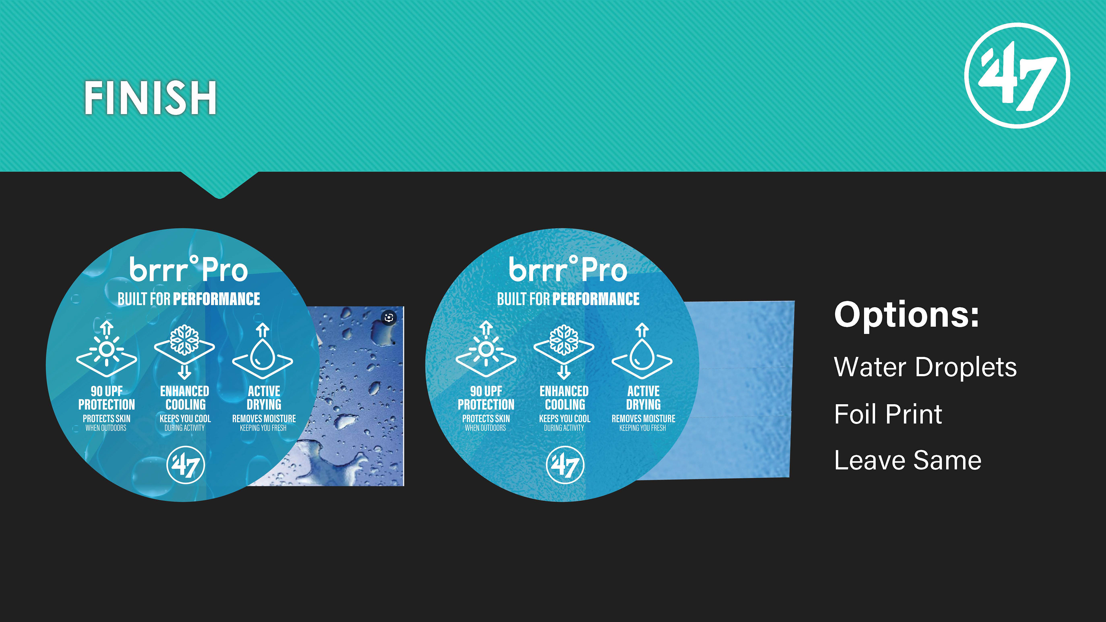
Step 4: Offer Additional Finish Options
Offered the product team some different finish options that would elevate the brrr pro sticker to help justify to the consumer the increased price point.
Step 5: Finalize
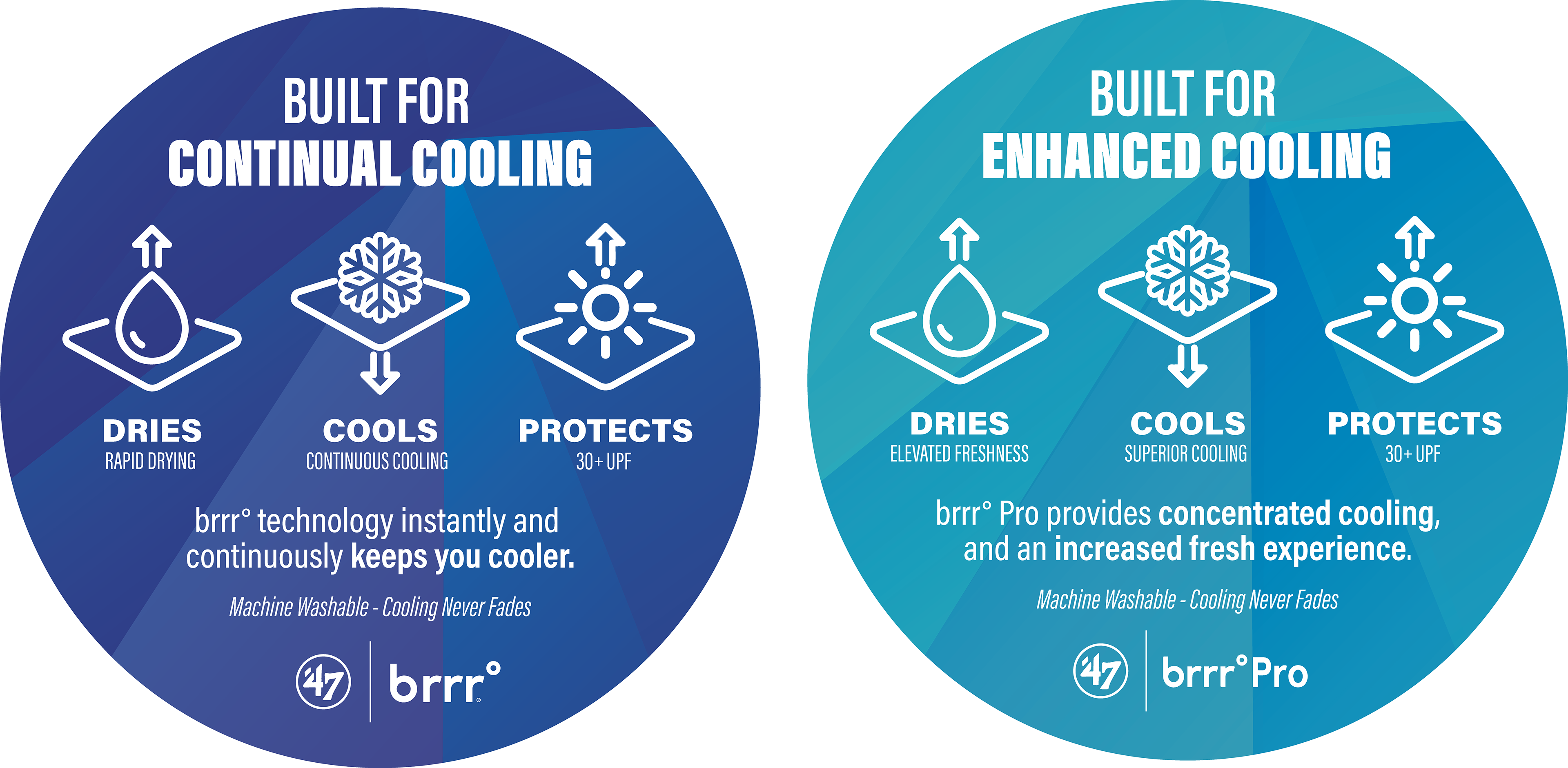
The final designs were approved from our VP of Creative and Head of Headwear development. The Tiffany blue creates an elevated separation between brrr and brrr Pro. The new icons are front and center allow consumers to quickly and easily understand all F&B. Lastly wanted to include the materials ability to be machine washable as if a consumer is using our hat for performance it would be important for the hat to be easily cleaned.